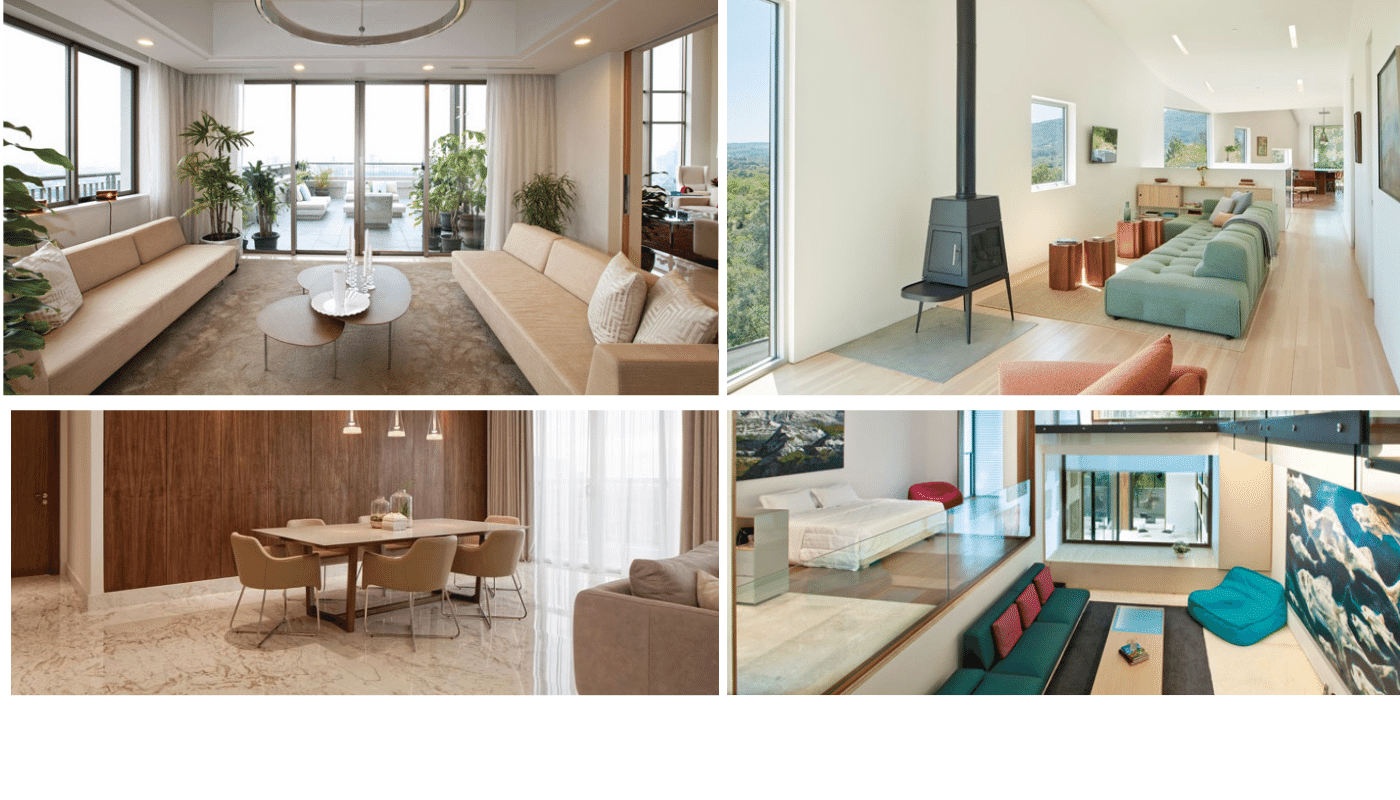
Natural Base
When creating a classic minimalistic interior, it's all about the base colour. Subdued hues rule here—from biscuit to greige and every ecru-inspired tone in between. Why? It's clean, fresh-looking, and inspires a sense of calm. But just because classic minimalism tends to be colour-averse, it doesn't have to be bland or boring. In fact, minimalism at its finest is quite the opposite
Eliminate Clutter
Eliminating clutter and extraneous objects is also a hallmark of minimalist interior design. This simplicity allows the focus to remain on the room’s purpose and function, and on the beauty of its carefully selected furnishings
Minimalist Colours
From a comforting oasis of a minimalist bedroom to common areas featuring stark simplicity, stick to a trio of hues per room that are just a few shades apart from each other for smooth consistency and a tight edit.
By creating a concise palette, you’ll have a better sense of direction in creating a well-edited, modern minimalist house grounded with neutrals that are easy to work with including whites, creams, blacks, and greys.
Quality Over Quantity
To embrace minimalist design, avoid the challenges of having so little to work with by buying quality over quantity and invest in classics that are both eye-catching and certain to keep their appeal for the long haul. The rule being that if an item doesn’t have a dedicated space for it then it must be deemed unnecessary
Accentuation
Designing a minimalist home doesn’t mean you need to avoid decorations and bright colours. The rule is to simply use decorative elements as accents and not overwhelm your home with a lot of things. Similarly, for art, choose focal pieces instead of a group of small ones.
